CSS 下拉菜单、提示工具、图片廊、计数器
最佳答案 问答题库798位专家为你答疑解惑
一、CSS 下拉菜单:
CSS下拉菜单用于创建一个鼠标移动上去后显示下拉菜单的效果。示例:
<style>
.dropdown {
position: relative;
display: inline-block;
}
.dropdown-content {
display: none;
position: absolute;
background-color: #f9f9f9;
min-width: 160px;
box-shadow: 0px 8px 16px 0px rgba(0,0,0,0.2);
padding: 12px 16px;
}
.dropdown:hover .dropdown-content {
display: block;
}
</style>
<div class="dropdown">
<span>鼠标移动到我这!</span>
<div class="dropdown-content">
<p>唐诗</p>
<p>宋词</p>
</div>
</div>
可以使用任何的HTML元素来打开下拉菜单。使用容器元素(如<div>)来创建下来菜单的内容,并放在任何想放的位置上。使用<div>元素来包裹这些元素,并使用CSS来设置下拉内容的样式。.dropdowm类使用position:relative,将设置下拉菜单的内容放置在下拉按钮右下角位置;.dropdowm-content类中是实际的下拉菜单,默认是隐藏的,在鼠标移动到指定元素后会显示。
<style>
.dropbtn {
background-color: BLUE;
color: white;
padding: 16px;
font-size: 16px;
border: none;
cursor: pointer;
}
.dropdown {
position: relative;
display: inline-block;
}
.dropdown-content {
display: none;
position: absolute;
background-color: #f9f9f9;
min-width: 160px;
box-shadow: 0px 8px 16px 0px rgba(0,0,0,0.2);
}
.dropdown-content a {
color: black;
padding: 12px 16px;
text-decoration: none;
display: block;
}
.dropdown-content a:hover {background-color: #f1f1f1}
.dropdown:hover .dropdown-content {
display: block;
}
.dropdown:hover .dropbtn {
background-color: #3e8e41;
}
</style>
<div class="dropdown">
<button class="dropbtn">下拉菜单</button>
<div class="dropdown-content">
<a href="http://www.runoob.com">唐诗</a>
<a href="http://www.runoob.com">宋词</a>
</div>
</div>
二、CSS 提示工具:
提示工具(tooltip)在鼠标移动到指定元素后触发。示例:
<style>
.tooltip {
position: relative;
display: inline-block;
border-bottom: 1px dotted black;
}
.tooltip .tooltiptext {
visibility: hidden;
width: 120px;
background-color: black;
color: #fff;
text-align: center;
border-radius: 6px;
padding: 5px 0;
/* 定位 */
position: absolute;
z-index: 1;
}
.tooltip:hover .tooltiptext {
visibility: visible;
}
</style>
<body style="text-align:center;">
<div class="tooltip">鼠标移动到这
<span class="tooltiptext">提示文本</span>
</div>
</body>
HTML使用容器类元素(如<div>)添加“tooltip”类,在鼠标移动到<div>上时显示提示信息。提示文本放在内联元素上(如<span>)并使用class = “tooltiptext”。CSS tooltip类使用position:relative,提示文本需要设置定位值position:absolute。tooltiptext类用于实际的提示文本。默认是隐藏的,在鼠标移动到元素显示。border-radius属性用于为提示框添加圆角。hover选择器用于在鼠标移动到指定元素<div>上时显示的提示。
定位提示工具:
<style>
.tooltip {
position: relative;
display: inline-block;
border-bottom: 1px dotted black;
}
.tooltip .tooltiptext {
visibility: hidden;
width: 120px;
background-color: black;
color: #fff;
text-align: center;
border-radius: 6px;
padding: 5px 0;
/* 定位 */
position: absolute;
z-index: 1;
top: -5px;
left: 105%;
}
.tooltip:hover .tooltiptext {
visibility: visible;
}
</style>
添加箭头:
<style>
.tooltip {
position: relative;
display: inline-block;
border-bottom: 1px dotted black;
}
.tooltip .tooltiptext {
visibility: hidden;
width: 120px;
background-color: black;
color: #fff;
text-align: center;
border-radius: 6px;
padding: 5px 0;
position: absolute;
z-index: 1;
bottom: 150%;
left: 50%;
margin-left: -60px;
}
.tooltip .tooltiptext::after {
content: "";
position: absolute;
top: 100%;
left: 50%;
margin-left: -5px;
border-width: 5px;
border-style: solid;
border-color: black transparent transparent transparent;
}
.tooltip:hover .tooltiptext {
visibility: visible;
}
</style>
<style>
.tooltip {
position: relative;
display: inline-block;
border-bottom: 1px dotted black;
}
.tooltip .tooltiptext {
visibility: hidden;
width: 120px;
background-color: black;
color: #fff;
text-align: center;
border-radius: 6px;
padding: 5px 0;
position: absolute;
z-index: 1;
top: 150%;
left: 50%;
margin-left: -60px;
}
.tooltip .tooltiptext::after {
content: "";
position: absolute;
bottom: 100%;
left: 50%;
margin-left: -5px;
border-width: 5px;
border-style: solid;
border-color: transparent transparent black transparent;
}
.tooltip:hover .tooltiptext {
visibility: visible;
}
</style>
<style>
.tooltip {
position: relative;
display: inline-block;
border-bottom: 1px dotted black;
}
.tooltip .tooltiptext {
visibility: hidden;
width: 120px;
background-color: black;
color: #fff;
text-align: center;
border-radius: 6px;
padding: 5px 0;
position: absolute;
z-index: 1;
top: -5px;
right: 110%;
}
.tooltip .tooltiptext::after {
content: "";
position: absolute;
top: 50%;
left: 100%;
margin-top: -5px;
border-width: 5px;
border-style: solid;
border-color: transparent transparent transparent black;
}
.tooltip:hover .tooltiptext {
visibility: visible;
}
</style>
淡入效果:可以使用 CSS3 transition 属性及 opacity 属性来实现提示工具的淡入效果。示例:
<style>
.tooltip {
position: relative;
display: inline-block;
border-bottom: 1px dotted black;
}
.tooltip .tooltiptext {
visibility: hidden;
width: 120px;
background-color: black;
color: #fff;
text-align: center;
border-radius: 6px;
padding: 5px 0;
position: absolute;
z-index: 1;
bottom: 100%;
left: 50%;
margin-left: -60px;
/* 淡入 - 1秒内从 0% 到 100% 显示: */
opacity: 0;
transition: opacity 1s;
}
.tooltip:hover .tooltiptext {
visibility: visible;
opacity: 1;
}
</style>
三、CSS图片廊:
CSS创建图片廊示例:
<style>
div.img {
margin: 5px;
border: 1px solid #ccc;
float: left;
width: 180px;
}
div.img:hover {
border: 1px solid #777;
}
div.img img {
width: 100%;
height: auto;
}
div.desc {
padding: 15px;
text-align: center;
}
</style>
</head>
<body>
<div class="responsive">
<div class="img">
<a target="_blank" href="http://static.runoob.com/images/demo/demo1.jpg">
<img src="http://static.runoob.com/images/demo/demo1.jpg" alt="图片文本描述" width="300" height="200">
</a>
<div class="desc">这里添加图片文本描述</div>
</div>
</div>
<div class="responsive">
<div class="img">
<a target="_blank" href="http://static.runoob.com/images/demo/demo2.jpg">
<img src="http://static.runoob.com/images/demo/demo2.jpg" alt="图片文本描述" width="300" height="200">
</a>
<div class="desc">这里添加图片文本描述</div>
</div>
</div>
<div class="responsive">
<div class="img">
<a target="_blank" href="http://static.runoob.com/images/demo/demo3.jpg">
<img src="http://static.runoob.com/images/demo/demo3.jpg" alt="图片文本描述" width="300" height="200">
</a>
<div class="desc">这里添加图片文本描述</div>
</div>
</div>
<div class="responsive">
<div class="img">
<a target="_blank" href="http://static.runoob.com/images/demo/demo4.jpg">
<img src="http://static.runoob.com/images/demo/demo4.jpg" alt="图片文本描述" width="300" height="200">
</a>
<div class="desc">这里添加图片文本描述</div>
</div>
</div>
</body>
四、CSS 图像透明/不透明:
CSS Opacity属性是W3C的CSS3建议的一部分。创建一个透明的图像:
img
{
opacity:0.4; filter:alpha(opacity=40);
}
五、CSS 图像拼合技术:
图像拼合就是单个图像的集合。示例:
<style>
img.home {
width: 46px;
height: 44px;
background: url(/images/img_navsprites.gif) 0 0;
}
img.next {
width: 43px;
height: 44px;
background: url(/images/img_navsprites.gif) -91px 0;
}
</style>
</head>
<body>
<img class="home" src="/images/img_trans.gif"><br><br>
<img class="next" src="/images/img_trans.gif">
</body>
使用图像拼合创建一个导航列表:
<style>
#navlist{position:relative;}
#navlist li{margin:0;padding:0;list-style:none;position:absolute;top:0;}
#navlist li, #navlist a{height:44px;display:block;}
#home{left:0px;width:46px;}
#home{background:url('/images/img_navsprites.gif') 0 0;}
#prev{left:63px;width:43px;}
#prev{background:url('/images/img_navsprites.gif') -47px 0;}
#next{left:129px;width:43px;}
#next{background:url('/images/img_navsprites.gif') -91px 0;}
</style>
</head>
<body>
<ul id="navlist">
<li id="home"><a href="/"></a></li>
<li id="prev"><a href="/css/"></a></li>
<li id="next"><a href="/css/"></a></li>
</ul>
</body>
六、CSS 媒体类型:
媒体类型允许指定文件如何在不同的媒体上呈现。@media规则允许在相同样式表为不同媒体设置不同的样式。示例:
<style>
@media screen
{
p.test {font-family:verdana,sans-serif;font-size:14px;}
}
@media print
{
p.test {font-family:times,serif;font-size:10px;}
}
@media screen,print
{
p.test {font-weight:bold;}
}
</style>
</head>
<body>
<p class="test">唐诗三百首!!!</p>
</body>
媒体类型:

七、CSS 属性选择器:
具有特定属性的HTML元素样式不仅仅是class和id,比如:
<style>
[title]
{
color:blue;
}
</style>
<style>
[title=hi]
{
border:5px solid green;
}
</style>
<style>
[title~=hello]
{
color:blue;
}
</style>
<style>
input[type="text"]
{
width:150px;
display:block;
margin-bottom:10px;
background-color:yellow;
}
input[type="button"]
{
width:120px;
margin-left:35px;
display:block;
}
</style>
八、CSS 表单:
使用CSS来渲染HTML的表单元素:
<style>
input[type=text], select {
width: 100%;
padding: 12px 20px;
margin: 8px 0;
display: inline-block;
border: 1px solid #ccc;
border-radius: 4px;
box-sizing: border-box;
}
input[type=submit] {
width: 100%;
background-color: #4CAF50;
color: white;
padding: 14px 20px;
margin: 8px 0;
border: none;
border-radius: 4px;
cursor: pointer;
}
input[type=submit]:hover {
background-color: #45a049;
}
div {
border-radius: 5px;
background-color: #f2f2f2;
padding: 20px;
}
</style>
<body>
<h3>使用 CSS 来渲染 HTML 的表单元素</h3>
<div>
<form action="/action_page.php">
<label for="fname">First Name</label>
<input type="text" id="fname" name="firstname" placeholder="Your name..">
<label for="lname">Last Name</label>
<input type="text" id="lname" name="lastname" placeholder="Your last name..">
<label for="country">Country</label>
<select id="country" name="country">
<option value="australia">Australia</option>
<option value="canada">Canada</option>
<option value="usa">USA</option>
</select>
<input type="submit" value="Submit">
</form>
</div>
</body>
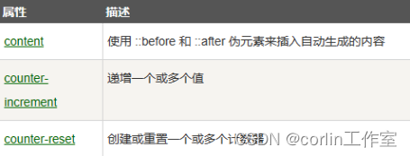
九、CSS计数器:
CSS计数器通过一个变量来设置,根据规则递增变量。CSS计数器使用到的属性:counter-reset - 创建或者重置计数器;counter-increment - 递增变量;content - 插入生成的内容;counter() 或 counters() 函数 - 将计数器的值添加到元素。要使用CSS计数器,得先使用counter-reset创建。示例:
<style>
body {
counter-reset: section;
}
h2::before {
counter-increment: section;
content: "Section " counter(section) ": ";
}
</style>
嵌套计数器:
<style>
body {
counter-reset: section;
}
h1 {
counter-reset: subsection;
}
h1::before {
counter-increment: section;
content: "Section " counter(section) ". ";
}
h2::before {
counter-increment: subsection;
content: counter(section) "." counter(subsection) " ";
}
</style>
CSS计数器属性:
99%的人还看了
相似问题
- UE5像素流送详细教程,以及解决黑边和鼠标消失问题
- Element UI 禁用数字输入框组件添加鼠标滚动事件
- JS-项目实战-鼠标悬浮变手势(鼠标放单价上生效)
- Linux输入设备应用编程(键盘,按键,触摸屏,鼠标)
- 98.qt qml-使用曲线图综合示例、支持多种鼠标交互、支持百万数据显示(已适配黑白风格)
- 跟随鼠标的粒子特效分享
- WPF实现将鼠标悬浮在按钮上时弹出菜单
- GPT-4V-Act :一个多模态AI助手,能够像人类一样模拟通过鼠标和键盘进行网页浏览。
- 掌握键盘快捷键,在没有鼠标的情况下,也还是可以做到游刃有余,甚至可以用数字键来代替鼠标
- opencv(3):控制鼠标,创建 tackbar控件
猜你感兴趣
版权申明
本文"CSS 下拉菜单、提示工具、图片廊、计数器":http://eshow365.cn/6-36681-0.html 内容来自互联网,请自行判断内容的正确性。如有侵权请联系我们,立即删除!