Wpf 使用 Prism 实战开发Day02
最佳答案 问答题库428位专家为你答疑解惑
一.设计首页导航条
导航条的样式,主要是从Material DesignThemes UI 拷贝过来修改的,项目用了这个UI组件库,就看自己需要什么,就去拷过来使用,界面布局或其他组件使用,不做介绍。 直接下载源码,编译运行就可以看到Demo 了
反正我下载完且编译后是能正常跑起来,没有办法跑起来的,找找自己的问题,是不是工作不努力了。接下来,是要把圈红色那块拷出来,做为主界面的导航条

1.最终导航栏效果图:
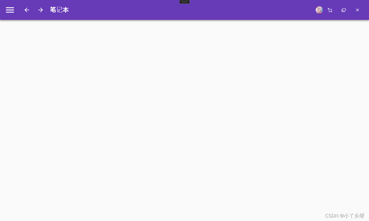
2. MainWindow.xaml 源码
<Window x:Class="MyToDo.MainWindow"xmlns="http://schemas.microsoft.com/winfx/2006/xaml/presentation"xmlns:x="http://schemas.microsoft.com/winfx/2006/xaml"xmlns:d="http://schemas.microsoft.com/expression/blend/2008"xmlns:mc="http://schemas.openxmlformats.org/markup-compatibility/2006"xmlns:local="clr-namespace:MyToDo"WindowStyle="None" WindowStartupLocation="CenterScreen" AllowsTransparency="True"Style="{StaticResource MaterialDesignWindow}"TextElement.Foreground="{DynamicResource MaterialDesignBody}"Background="{DynamicResource MaterialDesignPaper}"TextElement.FontWeight="Medium"TextElement.FontSize="14"FontFamily="{materialDesign:MaterialDesignFont}"mc:Ignorable="d"xmlns:materialDesign="http://materialdesigninxaml.net/winfx/xaml/themes"Title="MainWindow" Height="768" Width="1280"><materialDesign:DialogHost DialogTheme="Inherit"Identifier="RootDialog"SnackbarMessageQueue="{Binding ElementName=MainSnackbar, Path=MessageQueue}"><materialDesign:DrawerHost IsLeftDrawerOpen="{Binding ElementName=MenuToggleButton, Path=IsChecked}"><!--左边菜单--><materialDesign:DrawerHost.LeftDrawerContent><DockPanel MinWidth="220"></DockPanel></materialDesign:DrawerHost.LeftDrawerContent><DockPanel ><!--导航条色块--><materialDesign:ColorZone Padding="16" x:Name="ColorZone"materialDesign:ElevationAssist.Elevation="Dp4"DockPanel.Dock="Top"Mode="PrimaryMid"><DockPanel LastChildFill="False"><!--上左边内容--><StackPanel Orientation="Horizontal"><ToggleButton x:Name="MenuToggleButton"AutomationProperties.Name="HamburgerToggleButton"IsChecked="False"Style="{StaticResource MaterialDesignHamburgerToggleButton}" /><Button Margin="24,0,0,0"materialDesign:RippleAssist.Feedback="{Binding RelativeSource={RelativeSource Self}, Path=Foreground, Converter={StaticResource BrushRoundConverter}}"Command="{Binding MovePrevCommand}"Content="{materialDesign:PackIcon Kind=ArrowLeft,Size=24}"Foreground="{Binding RelativeSource={RelativeSource AncestorType={x:Type FrameworkElement}}, Path=(TextElement.Foreground)}"Style="{StaticResource MaterialDesignToolButton}"ToolTip="Previous Item" /><Button Margin="16,0,0,0"materialDesign:RippleAssist.Feedback="{Binding RelativeSource={RelativeSource Self}, Path=Foreground, Converter={StaticResource BrushRoundConverter}}"Command="{Binding MoveNextCommand}"Content="{materialDesign:PackIcon Kind=ArrowRight,Size=24}"Foreground="{Binding RelativeSource={RelativeSource AncestorType={x:Type FrameworkElement}}, Path=(TextElement.Foreground)}"Style="{StaticResource MaterialDesignToolButton}"ToolTip="Next Item" /><TextBlock Margin="16,0,0,0"HorizontalAlignment="Center"VerticalAlignment="Center"AutomationProperties.Name="Material Design In XAML Toolkit"FontSize="22"Text="笔记本" /></StackPanel><!--上右边图标--><StackPanel DockPanel.Dock="Right" Orientation="Horizontal"><Image Source="/Images/user.jpg" Width="25" Height="25"><Image.Clip><EllipseGeometry Center="12.5,12.5" RadiusX="12.5" RadiusY="12.5" /></Image.Clip></Image><Button x:Name="btnMin" Style="{StaticResource MaterialDesignFlatMidBgButton}"><materialDesign:PackIcon Kind="MoveResizeVariant" /></Button><Button x:Name="btnMax" Style="{StaticResource MaterialDesignFlatMidBgButton}"><materialDesign:PackIcon Kind="CardMultipleOutline" /></Button><Button x:Name="btnClose" Style="{StaticResource MaterialDesignFlatMidBgButton}" Cursor="Hand"><materialDesign:PackIcon Kind="WindowClose" /></Button></StackPanel></DockPanel></materialDesign:ColorZone></DockPanel></materialDesign:DrawerHost></materialDesign:DialogHost>
</Window>
3.MainWindow.xaml.cs 源码
namespace MyToDo
{/// <summary>/// Interaction logic for MainWindow.xaml/// </summary>public partial class MainWindow : Window{public MainWindow(){InitializeComponent();//最小化btnMin.Click += (s, e) =>{this.WindowState = WindowState.Minimized;//窗口设置最小};//最大化btnMax.Click += (s, e) =>{//判断窗口是否是最小化状态if (this.WindowState == WindowState.Maximized){this.WindowState = WindowState.Normal; //改成正常状态}else{this.WindowState = WindowState.Maximized;//最大化}};//关闭btnClose.Click += (s, e) =>{this.Close();};//鼠标拖动事件ColorZone.MouseMove += (s, e) =>{//如果鼠标在拖动if (e.LeftButton == MouseButtonState.Pressed){this.DragMove();//让窗口移动}};//导航栏双击事件ColorZone.MouseDoubleClick += (s, e) =>{//双击时,如果是窗口是正常形态,就变成最大化if (this.WindowState == WindowState.Normal){this.WindowState = WindowState.Maximized; }else{this.WindowState = WindowState.Normal;//否则就变成正常的}};}}
}
用法简介
1. 主界面MainWindow.xaml 引入 Material DesignThemes UI 命名空间,如下:
xmlns:materialDesign="http://materialdesigninxaml.net/winfx/xaml/themes" MainWindow 窗口设置以下几个属性
- 隐藏原窗口的边框 WindowStyle="None"
- 主窗口启动时居中 WindowStartupLocation="CenterScreen"
- 设置窗口属性为透明,用于隐藏窗口出现白边 AllowsTransparency="True"
DockPanel 属性,用的到列一下说明而已
- 取消最后一个元素填充:LastChildFill="False"
- 往右停靠:DockPanel.Dock="Right"
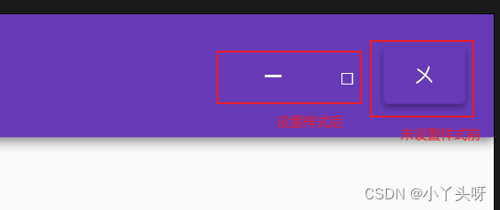
Material DesignThemes UI 样式,用来隐藏原生按钮边框
- Style="{StaticResource MaterialDesignFlatMidBgButton}"
未隐藏前后对比
图标可以使用UI 框架提供的
Image 属性,用来放置头像,并且使用裁剪属性使头像变成圆角
- Image.Clip 剪裁绝对定位元素
- EllipseGeometry 用来绘制一个椭圆或者圆形的图形
- RadiusX X轴半径
- RadiusY Y轴半径
例如:
<Image Source="/Images/user.jpg" Width="25" Height="25"><Image.Clip><EllipseGeometry Center="12.5,12.5" RadiusX="12.5" RadiusY="12.5" /></Image.Clip>
</Image>
效果:

对上面,我的理解就是,使用Image 时要设置高度和宽度,并且在用到裁剪属性的时候,X轴半径和Y轴半径就设置成 Image 高宽值的一半。所以就变成12.5
二.实现导航条右侧,最小化,最大化,关闭窗口功能
1. 通过事件的形式来实现最小化,最大化,及关闭的功能点
在 MainWindow.xaml.cs 构造函数中,抄上以下代码。我也是抄过来的
//最小化
btnMin.Click += (s, e) =>
{this.WindowState = WindowState.Minimized;//窗口设置最小
};
//最大化
btnMax.Click += (s, e) =>
{//判断窗口是否是最小化状态if (this.WindowState == WindowState.Maximized){this.WindowState = WindowState.Normal; //改成正常状态}else{this.WindowState = WindowState.Maximized;//最大化}
};
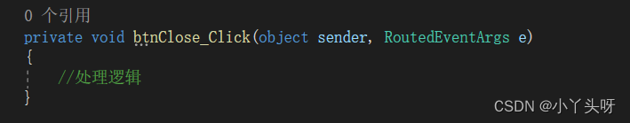
//关闭
btnClose.Click += (s, e) =>
{this.Close();
};突然长知识了,没有想到还有这样的写法。之前都是在前端界面绑定一个事件,3个按钮就要绑定3个,例如,像下面这样写法,每个按钮一个事件,代码就有点多,且不好看。
2. 让导航栏头部支持鼠标按住时,拖动窗口
在 MainWindow.xaml.cs 构造函数中,抄上以下代码。
//鼠标拖动事件ColorZone.MouseMove += (s, e) =>{//如果鼠标在拖动if (e.LeftButton == MouseButtonState.Pressed){this.DragMove();//让窗口移动}};3. 双击导航栏时,让窗口变大或恢复正常
在 MainWindow.xaml.cs 构造函数中,抄上以下代码。
//导航栏双击事件
ColorZone.MouseDoubleClick += (s, e) =>
{//双击时,如果是窗口是正常形态,就变成最大化if (this.WindowState == WindowState.Normal){this.WindowState = WindowState.Maximized; }else{this.WindowState = WindowState.Normal;//否则就变成正常的形态}
};
ColorZone,btnMin,btnMax,btnClose 都是前端xaml 页面定义的名称!
仅供自己学习记录,不做任何教程提供,不喜欢也请别喷我。这个是从b 站看视频学习wpf,就想记录一下。写的水平有限,也并不是写出来误导别人,毕竟你有没有基础我不知道,反正我看的懂就ok,方便我以后用的上时可以回来翻下笔记。仅此而已!!!
99%的人还看了
相似问题
猜你感兴趣
版权申明
本文"Wpf 使用 Prism 实战开发Day02":http://eshow365.cn/6-27532-0.html 内容来自互联网,请自行判断内容的正确性。如有侵权请联系我们,立即删除!