已解决
警务可视化 玫瑰图和柱折混合图
来自网友在路上 167867提问 提问时间:2023-10-27 17:04:03阅读次数: 67
最佳答案 问答题库678位专家为你答疑解惑


什么时候用,什么时候导入echarts

完整代码: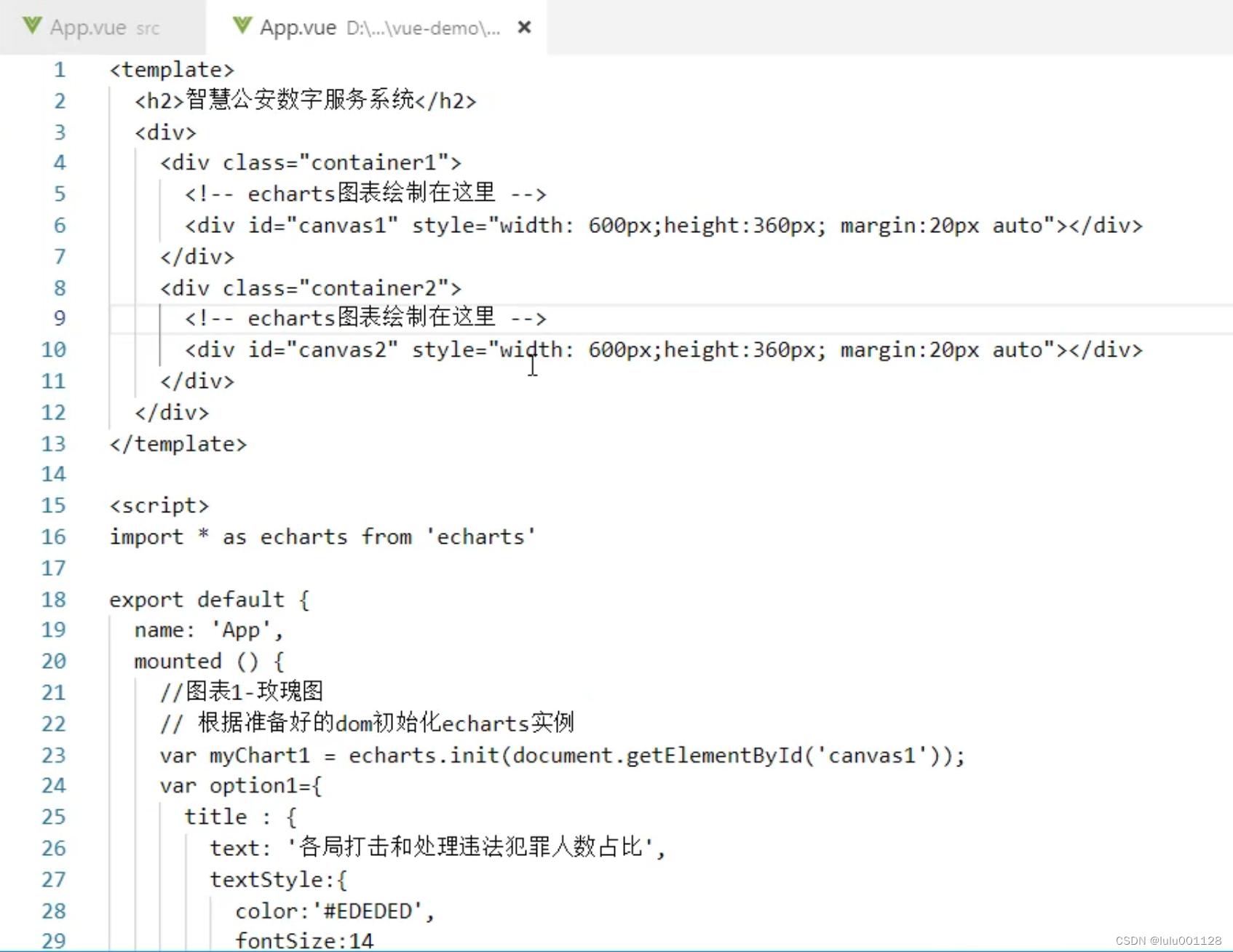


搭建页面结构的代码
html
<template><h2>智慧公安数字服务系统</h2><div><div class="container1"> </div> <div class="container2"></div></div>
</template>
css
*{padding:0;margin:0;
}
#app {font-family: Avenir, Helvetica, Arial, sans-serif;-webkit-font-smoothing: antialiased;-moz-osx-font-smoothing: grayscale;text-align: center;color: #2c3e50;width:100%;height:760px;background:url(./assets/bg.webp) no-repeat;background-size: contain;
}
h2{color:#fff;line-height:60px;
}
.container1{width:550px;height:360px;border:1px solid #0043A0;float:left;margin-left:70px;padding:10px;margin-top:70px;
}
.container2{width:550px;height:360px;border:1px solid #0043A0;float:right;margin-right:70px;padding:10px;margin-top:70px;
}
玫瑰图代码
html
<div id="canvas1" style="width: 600px;height:360px; margin:20px auto"></div>
js
import * as echarts from 'echarts'
export default {name: 'App',mounted () {//图表1-玫瑰图// 根据准备好的dom初始化echarts实例var myChart1 = echarts.init(document.getElementById('canvas1'));var option1={title : {text: '各局打击和处理违法犯罪人数占比',textStyle:{color:'#EDEDED',fontSize:14}},tooltip : {trigger: 'item',formatter: "{a} <br/>{b} : {c} ({d}%)"},series : [{name:'案件类型',                  type:'pie',                       radius : [35, 100], // 图表内外半径大小center : ['45%', '50%'], // 图表位置roseType : 'area',// 修改字体颜色的代码beginitemStyle: {normal: {label: {textStyle: {color:'#EDEDED',fontSize: 12}}}},data:[{value:514, name:'行政拘留'},    {value:428, name:'移送起诉'},{value:397, name:'罚款'},{value:214, name:'刑事拘留'},{value:103, name:'社区戒毒'},{value:56, name:'强制戒毒'}]}]}myChart1.setOption(option1);}
}
柱折混合图
html
<div id="canvas2" style="width: 600px;height:360px; margin:20px auto"></div>
js
//图表4-柱折混合图// 根据准备好的dom初始化echarts实例var myChart2 = echarts.init(document.getElementById('canvas2'));var option2={title:{text:'近一年受案量趋势',textStyle:{color:'#EDEDED',fontSize:14}},tooltip: {trigger: 'axis',},legend: {data:['受案量','同比'],x:'center',textStyle: {fontSize: 12,color: '#EDEDED',}, },xAxis: {data: ['1月', '2月', '3月', '4月', '5月', '6月', '7月', '8月', '9月', '10月', '11月', '12月'],axisLine: {lineStyle: {color: '#EDEDED',},},},yAxis: {type: 'value',axisLine: {lineStyle: {color: '#EDEDED',},},},series: [{name: '受案量',type: 'bar',barWidth : '28%',data: [241, 221, 188, 167, 126, 231, 194, 157, 254, 166, 283, 215],markPoint: { data: [ { type: 'max', name: '最大值' } ] },},{name: '同比',type: 'line',smooth:true,data: [48, 34, 22, 16, 12, 36, 20, 14, 53, 17, 67, 27],label: {show: true,position: 'top',textStyle: {fontSize: 12}}}]}myChart2.setOption(option2);
查看全文
99%的人还看了
相似问题
猜你感兴趣
版权申明
本文"警务可视化 玫瑰图和柱折混合图":http://eshow365.cn/6-26186-0.html 内容来自互联网,请自行判断内容的正确性。如有侵权请联系我们,立即删除!
- 上一篇: R语言代码示例
- 下一篇: python的pass简介